Beware Spurious Correlations
Tyler Vigen manages a humorous website entitled Spurious Correlations. He mines research data from datasets, finds data with similar trends, and creates a chart graphing that data. The result is a “spurious correlation”. The charts do not imply causation, but rather they are an entertaining visualization of statistics and data manipulation.
Examples of his spurious correlations include:
- number of people who drowned by falling into a pool correlates with films Nicholas Cage appeared in
- per capita cheese consumption correlates with number of people who died by becoming entangled in their bedsheets
- divorce rate in Maine correlates with per capita consumption of margarine
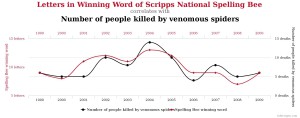
- and, the one pictured above, letters in winning word of Scripps National Spelling Bee correlates with number of people killed by venomous spiders
Spurious Correlations makes a serious point behind the amusing posts. Researchers and consumers both need to be critical about what data actually represents. Does A really cause B? Their are a multitude of companies trying to sell an array of consumer products, medications, or supplements that are hoping consumers see causation that just doesn’t exist.
While Vigen is not a statistician, he has a few sensible caveats when dealing with statistics, especially if there is a sensational story attached:
- “be critical or statistics”
- “look for a causal link or mechanism”
- “demand scientific rigor in showing a strong statistically significant correlation”
Jill