Author Archives: Jill Turner

Happy New Year and Welcome back!

citation needed

I hope your holidays were restful. This is just a quick reminder that if you need assistance finding articles or using any of the library’s resources, please don’t hesitate to contact either me or any of the librarians. I will be resuming CHP hours in the student lounge beginning on January 25th.

I look forward to working with you!   – Jill Turner

Nature of Naval Fluff

4267804725_ae3f71cef4_z


Due to finals week being right around the bend, I decided to keep this posting light.

Turns out someone put forth a theory on belly button lint… and actually ran an experiment. In a faintly comical article, Georg Steinhauser offered an hypothesis for what comprises belly button lint and how it accumulates. According to Steinhauser, belly button lint accumulates as a result of abdominal hair pushing fibers towards the naval. The fibers collect in this indented central location and are mashed together into the familiar ball of fluff. As expected, the fibers come from the sloughing of cotton shirts. Logically, new shirts produce more lint than older shirts. In fact, Steinhauser’s experiment showed that over the course of a year a shirt could loose as much as 182 mg of weight in fibers that end up as belly button lint. The fibers also contain skin cells and miscellaneous other substances. Humorously, Steinhauser includes 2 figures in his article. Figure 1 shows an example of a lint collecting belly button and a non-lint collecting belly button. Figure 2 is a graph entitled “Mass distribution of the 503 pieces of navel lint in steps of 0.10 mg”. Steinhauser also proposed that the “phenomenon” of belly button lint accumulation could “be regarded as a kind of incidental cleaning function of the navel”.

I’m not including the photo; it was kinda gross.

Jill


Steinhauser, G. (2009). The nature of navel fluffMedical hypotheses72(6), 623-625. doi: 10.1016/j.mehy.2009.01.015.

Beware Spurious Correlations

spurious correlations


Tyler Vigen manages a humorous website entitled Spurious Correlations. He mines research data from datasets, finds data with similar trends, and creates a chart graphing that data. The result is a “spurious correlation”.  The charts do not imply causation, but rather they are an entertaining visualization of statistics and data manipulation.

Examples of his spurious correlations include:

  • number of people who drowned by falling into a pool correlates with films Nicholas Cage appeared in
  • per capita cheese consumption correlates with number of people who died by becoming entangled in their bedsheets
  • divorce rate in Maine correlates with per capita consumption of margarine
  •  and, the one pictured above, letters in winning word of Scripps National Spelling Bee correlates with number of people killed by venomous spiders

Spurious Correlations makes a serious point behind the amusing posts. Researchers and consumers both need to be critical about what data actually represents. Does A really cause B? Their are a multitude of companies trying to sell an array of consumer products, medications, or supplements that are hoping consumers see causation that just doesn’t exist.

While Vigen is not a statistician, he has a few sensible caveats when dealing with statistics, especially if there is a sensational story attached:

  • “be critical or statistics”
  • “look for a causal link or mechanism”
  • “demand scientific rigor in showing a strong statistically significant correlation”


Jill


Figure 1: Medical Images App

Figure 1Figure 1 is a photosharing social media app that has been described as “Instagram for physicians”. In a broad sense it is, but it is also more. Figure 1 is an online community not only for physicians but also for other health professionals who might find medical image sharing a useful tool in their practices: nurses, PA’s, medical and nursing students. The app is free and is available for both Apple products as well as Android devices.

Figure 1 is a crowd-sourced product; users can upload and share photos from their clinical practice, ask questions, and post educational comments. Health professionals can discuss clinical cases and treatment options all while maintaining patient privacy. The app provides automatic face blocking and in-app privacy release forms.  The in-app photo editor allows users to crop images and add arrows that draw attention to specific locations in the image (iMedicalApp.com). The app categorizes images into 2 brows-able lists: Anatomy (eg. Aorta, reproductive organs, spleen, etc) and Specialty (eg. Rheumatology, Plastic Surgery, Oncology, etc.). Not sure what an ACL rupture looks like through a laparoscope? Check the app. Never seen squamous cell carcinoma? Check the app. Wonder what the damage a self inflicted gun shot wound to the head looks like on xray? Check the app. According to the notes on Figure 1, it also “searches a list of approved medical websites for images.” Although, I could not find the list of approved websites documented anywhere.

Figure 1iMedicalApps.com gives Figure 1 high marks with comments like “careful attention paid to its custom interface and fluid user experience”. “Submitting a photo is no more difficult than doing so in Instagram, and the privacy features (automatic face detection and blocking) and editing features (adding arrow markers, cropping) all work without a hitch.” Beware however, these images are not copyright free. Figure 1′s Terms of Service prohibit sharing screenshots of Figure 1 images on other venues.

Jill


Looking for Clinical Effectiveness Research? – Search PubMed Health

PM Health


PubMed Health ”specializes in reviews of clinical effectiveness research, with easy-to-read summaries for consumers as well as full technical reports. Clinical effectiveness research finds answers to the question “What works?” in medical and health care.

“A search on PubMed Health runs simultaneously in PubMed. A filter is used to identify all the indexed scientific articles at the NLM that might be systematic reviews.” PubMed Health contents include DARE reviews, executive summaries, clinical guides, full text systematic reviews, and consumer information.

DARE or “Database of Abstracts of Reviews of Effects” Reviews “contains details of systematic reviews that evaluate the effects of healthcare interventions and the delivery and organization of health services.”

Executive Summaries are exactly what they sound like. A subject expert has read a systematic review and written a summary of the important information contained in the review.

The consumer health information contains information similar to that in the executive summaries but is written in “plain language” rather than medical terms.

PubMed Health can be accessed from the PubMed homepage. Under the Popular column at the bottom of the page is a link to PubMed Health. To search PubMed Health, use a keyword search or browse the Contents section.

Happy searching!

Jill

Welcome Back!

welcomeIt has been a short summer, but I am happy to be back into my routine.

I have put together a few new hand-outs and videos on finding full articles online. I have streamlined the process, and hopefully, it won’t be as confusing. We can now search for full articles using the PMID (PubMed Identification) number. YEA! See the Find Articles section of the Nursing and Physician Assistant Library Guides  as well as the Library Assistance tabs for links to the new instructions. I still have a few more to create. They will be posted as I get them completed.

Remember, the librarians are here to assist you, so please don’t hesitate to contact one of us if you need help using the library resources or performing literature reviews.

Have a great term!

Jill

The Ultimate Pandemic

512px-1918_flu_outbreak_RedCrossLitterCarriersSpanishFluWashingtonDC
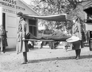
H1N1, Ebola, SARS … all are examples of epidemics / pandemics within the last fifteen years. SARS (severe acute respiratory syndrome) was the first pandemic of the 21st century. It killed 774 people in 26 countries. Ebola is the most recent epidemic of the 21st century. There have been 11,283 reported deaths, according the World Health Organization. The ultimate pandemic however was the “Spanish” flu of 1918. Total deaths were estimated at about 50 million with some counts as high as 100 million!

The Digital Public Library of America contains an online exhibit “America During the 1918 Influenza Pandemic”. The exhibit was created by five library science students from Wayne State University. There are four themes to choose from: The Flu Strikes: 1918; The Impact of the Flu; The Military Fights the Flu; and Legacy of the Pandemic. Each theme contains multiple photos along with narrative.

It is a fascinating peak into America’s response to the worst pandemic in the history of the world.

Jill

References:

Campbell, Bethany, Michelle John, Samantha Reid-Goldberg, Anne Sexton, and John Weimer. America During the 1918 Influenza Pandemic. Digital Public Library of America. April 2015. http://dp.la/exhibitions/exhibits/show/1918-influenza

Johnson, N. P., & Mueller, J. (2002). Updating the accounts: Global mortality of the 1918-1920 “spanish” influenza pandemic. Bulletin of the History of Medicine, 76(1), 105-115. doi:S1086317602101050 [pii]

Patterson, K. D., & Pyle, G. F. (1991). The geography and mortality of the 1918 influenza pandemic. Bulletin of the History of Medicine, 65(1), 4-21.

Peiris, J. S. M., Yuen, K. Y., Osterhaus, A. D. M. E., & Stöhr, K. (2003). The severe acute respiratory syndrome. N Engl J Med, 349(25), 2431-2441. doi:10.1056/NEJMra032498

Taubenberger, J. K., & Morens, D. M. (2006). 1918 influenza: The mother of all pandemics. Emerging Infectious Diseases, 12(1), 15-22. doi:10.3201/eid1201.050979 [doi]

A Follow up on Data Misrepresentation

2920562020_e808543f0b_oLast posting I highlighted two books written by bad science guru Dr. Ben Goldacre. This time I am passing on another (shorter) source that came across my desk last week. Jordan Ellenberg wrote a short posting for the Wall Street Journal, How Not to Be Mislead by Data, that provides several examples of how accurate data can be presented in a way that can lead a reader into unsound conclusions. Dr. Ellenberg talks about the following data presentation errors.

1. Failure to compare – “a number by itself is often meaningless. It is the comparison between numbers that carries the force”.

2. Unrepresentative representative – providing a number that is on an extreme end of a scale without acknowledging the rest of the points on the scale “is a kind of numerical malpractice”.

3. Needle in a haystack – pulling the most compelling data from a study (which may be a small finding in comparison to the whole) then generalizing the small compelling finding to the whole.

4. More is more – the old “apples to apples” maxim. Dr. Ellenberg’s example talks about comparing the box-office take of two movies, one from 1965 and the other from 2013. The movie from 2013 cannot be labelled a bigger hit simply because it’s earnings were larger. One must take the cost of inflation into consideration as well.

Happy Summer!

Jill

cc: Photo courtesy of Tom Woodward


Page 4 of 7...23456...